Pockets: See Your Money Clearly
A capstone UX project designed to turn financial chaos into visual clarity — through intention and mobile pay.
1 in 3
Young adults lack financial literacy
6
Interview participants across demographics
Real Time
Pocket balances that update as you spend
The Problem
Traditional banking apps are abstract and passive — they don't show where your money is going or how to manage it in real time.
This leads to stress, avoidance, and financial anxiety. People are guessing their way through money management.
No Budget
No framework for how money should be allocated before spending begins.
No Visibility
No real-time view of what's actually available to spend right now.
No System
No organized structure that makes managing money feel intuitive.
How I Investigated
I launched an open-ended survey and conducted live interviews with young adults to understand their real-world frustrations, habits, and financial anxiety triggers.
Survey & demographic targeting
Interview sessions with guide
Affinity & empathy mapping
Personas & behavioral insights
Interview Participants
Participant #1
🧍 Age: 21–25
💼 Works: 31–40 hrs
😊 Comfortable: 3/5
💪 Confident: 3/5
💳 Expenses: car, cell, credit, rent, subs, other
🏦 Loans: student, auto
📆 Credit Card Use: 3–6×/mo
😰 Stress: a lot (70% financial)
Participant #2
🧍 Age: 26–31
💼 Works: 40+ hrs
😊 Comfortable: 2/5
💪 Confident: 2/5
💳 Expenses: rent, cell, utilities, credit, subs, other
🏦 Loans: student, credit
📆 Credit Card Use: 11+×/mo
😰 Stress: a lot (80% financial)
Participant #3
🧍 Age: 32+
💼 Works: 40+ hrs
😊 Comfortable: 2/5
💪 Confident: 2/5
💳 Expenses: rent, car, cell, utilities, credit, subs
🏦 Loans: auto
📆 Credit Card Use: 1–2×/mo
😰 Stress: always (80% financial)
Participant #4
🧍 Age: 21–25
💼 Works: 31–40 hrs
😊 Comfortable: 4/5
💪 Confident: 3/5
💳 Expenses: car, cell, rent, credit card, subs
🏦 Loans: auto
📆 Credit Card Use: 3–6×/mo
😰 Stress: most of the time (50% financial)
Participant #5
🧍 Age: 32+
💼 Works: 11–20 hrs
😊 Comfortable: 2/5
💪 Confident: 2/5
💳 Expenses: rent, car, cell, utilities, credit card, subs
🏦 Loans: student, auto, credit
📆 Credit Card Use: 11+×/mo
😰 Stress: always (70% financial)
Participant #6
🧍 Age: 21–25
💼 Works: 32–40 hrs
😊 Comfortable: 3/5
💪 Confident: 3/5
💳 Expenses: rent, cell, utilities, subs
🚫 No credit card
😰 Stress: often (30% financial)
User Insight
"How much do I actually have to spend right now?"
"Being able to see visually on a piece of paper what I am spending is everything."
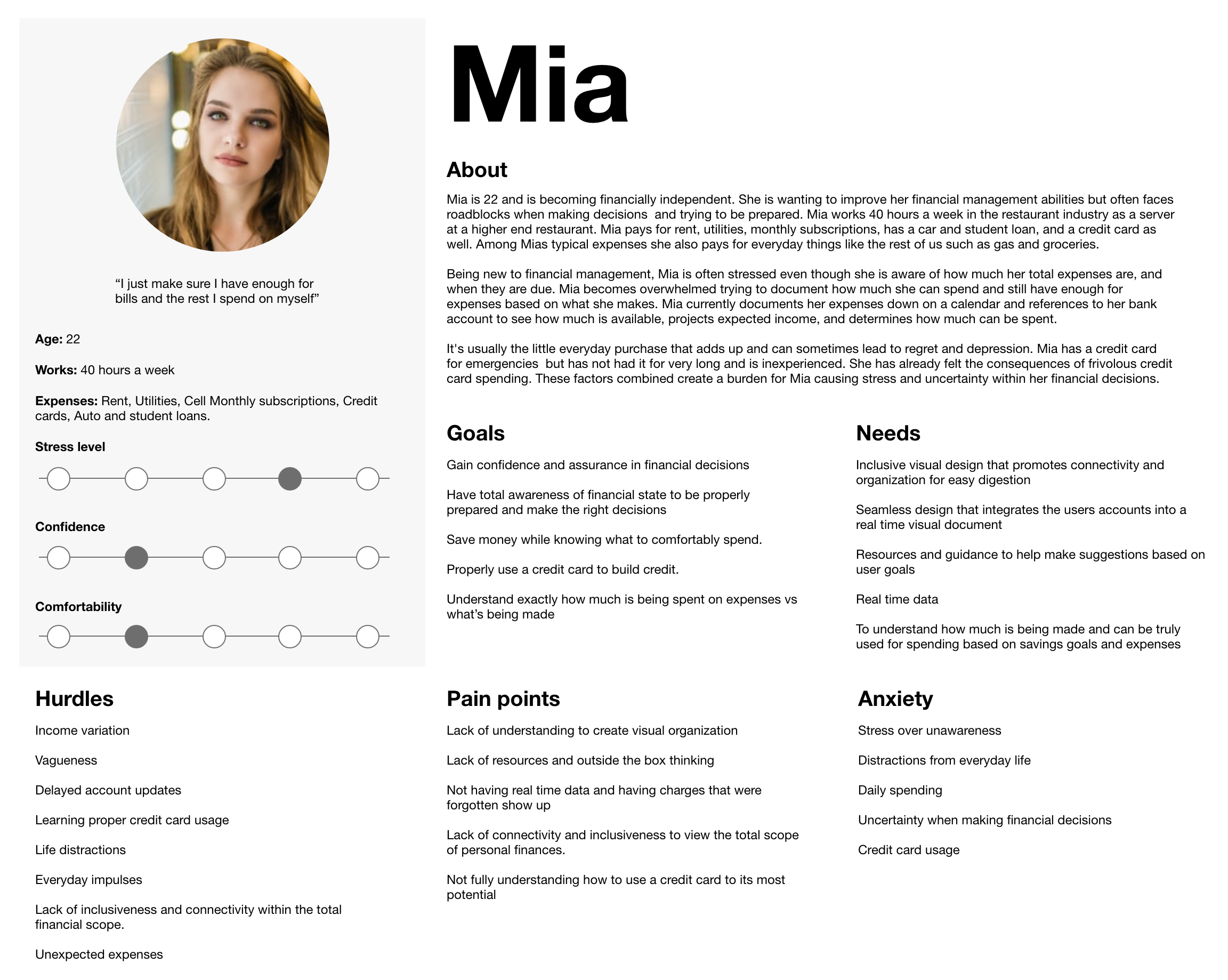
Meet Mia
A 24-year-old full-time worker who struggles to track spending and wants a more visual way to spend money.
What Competitors Miss
I evaluated Mint, Simplifi, and EveryDollar through a heuristic lens and live testing. Each offers budgeting tools and clean interfaces — but all three fall short on one core experience:
"How much money do I actually have to spend right now?"
All three fail to show real-time spendable money. They surface useful data — but leave the work of making it usable up to the user.
| App | What It Does | What It Misses |
|---|---|---|
| Mint | Category bars and graphs | No real-time clarity |
| Simplifi | Manual setup and tracking | Feels disconnected from daily money |
| EveryDollar | Zero-based budgeting | Requires heavy editing and upkeep |
"Most tools treat budgeting like a ledger — not a living, breathing process. If we were still managing cash, none of these apps would actually help you handle it day to day."
Synthesis & Opportunity
"Being able to see visually on a piece of paper what I'm spending is everything."
How might we
help people make confident financial decisions — without stress?
How might we
provide resources that help people stay aware and prepared?
How might we
organize financial information so it's easy to digest and interact with?
Designing the Experience
The Vision
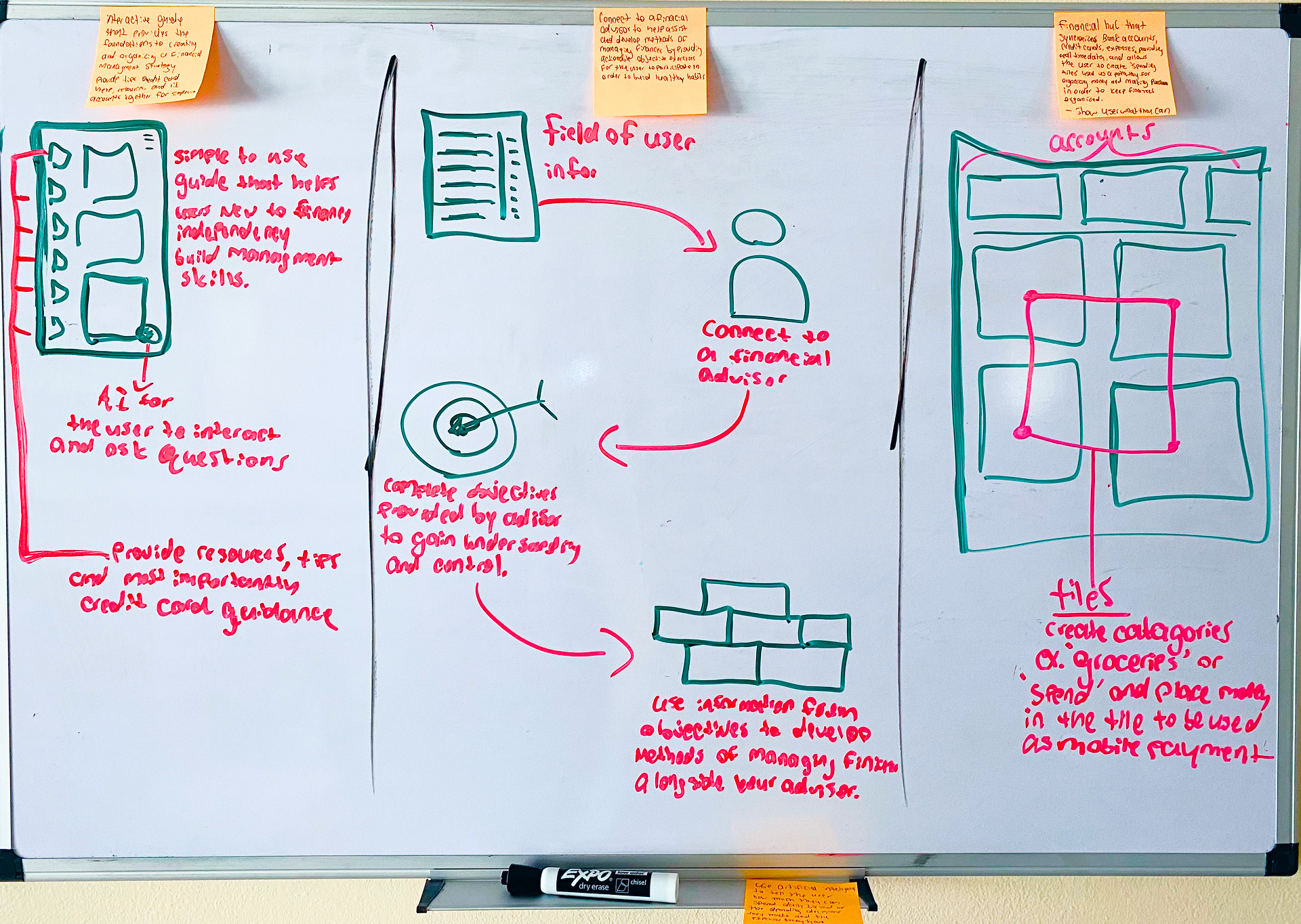
Pockets is a mobile app that connects to your bank, lets you allocate money to named Pockets (like "Food" or "Rent"), and pay directly from those Pockets — so you always know what's left.
Visual budgeting like cash envelopes
Real-time Pocket balances
Mobile Pay from any Pocket
MVP Prioritization
I defined the MVP by prioritizing user stories, then mapped out the key steps users would take to achieve their goals — forming the foundation for the product's structure.
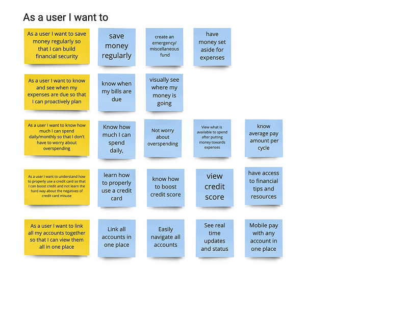
Map of early user stories
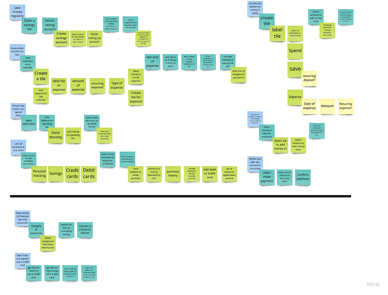
Define MVP scope
How It Works
The core flow: connect your bank, fill your Pockets, spend with intention.
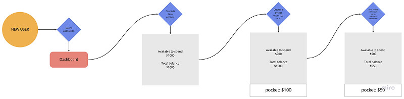
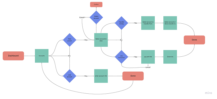
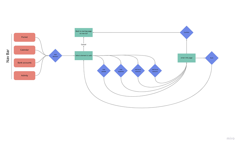
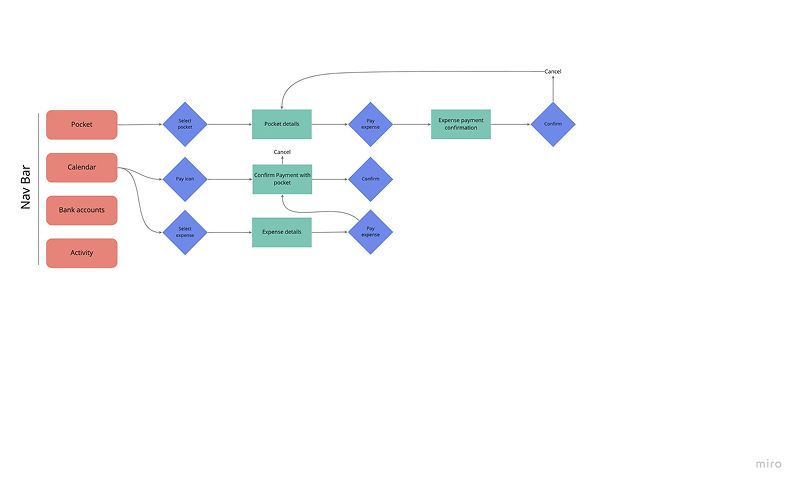
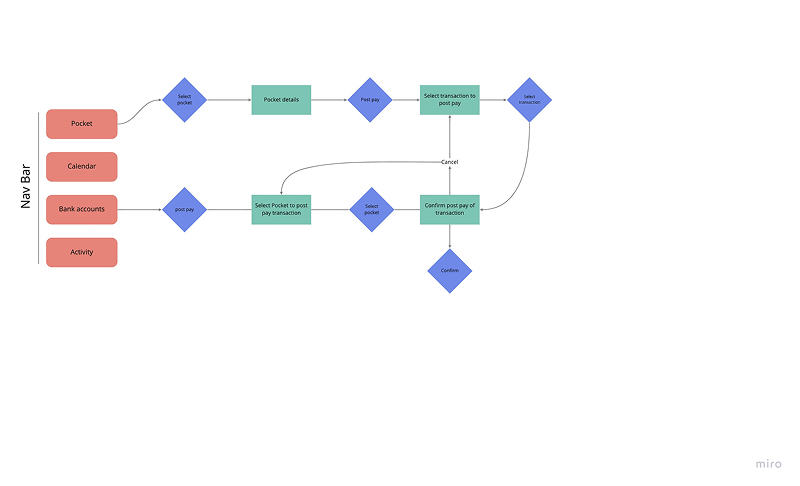
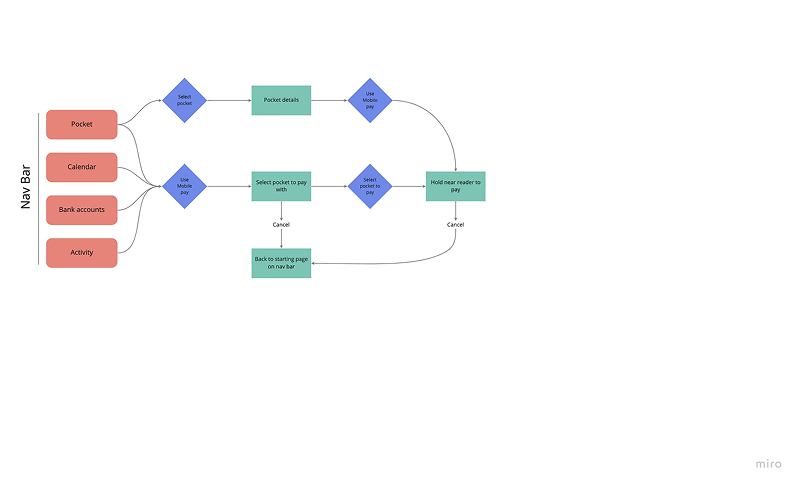
Red Routes
These are the essential actions a user must be able to complete quickly and reliably.
Paper Prototype
"All inclusive, easy interface. Allocating money that can be used in real time would be ideal."
Quick sketches helped validate flow, visibility, and emotional trust before jumping into Figma.
View Live Prototype ↗Wireframes & Flows
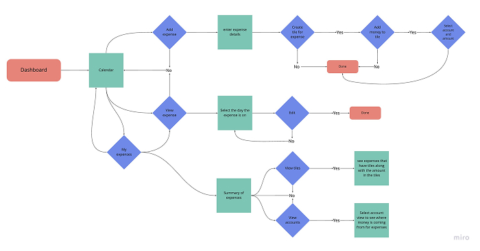
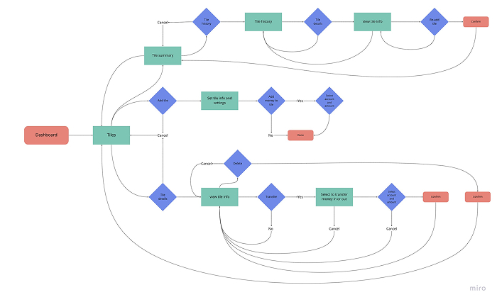
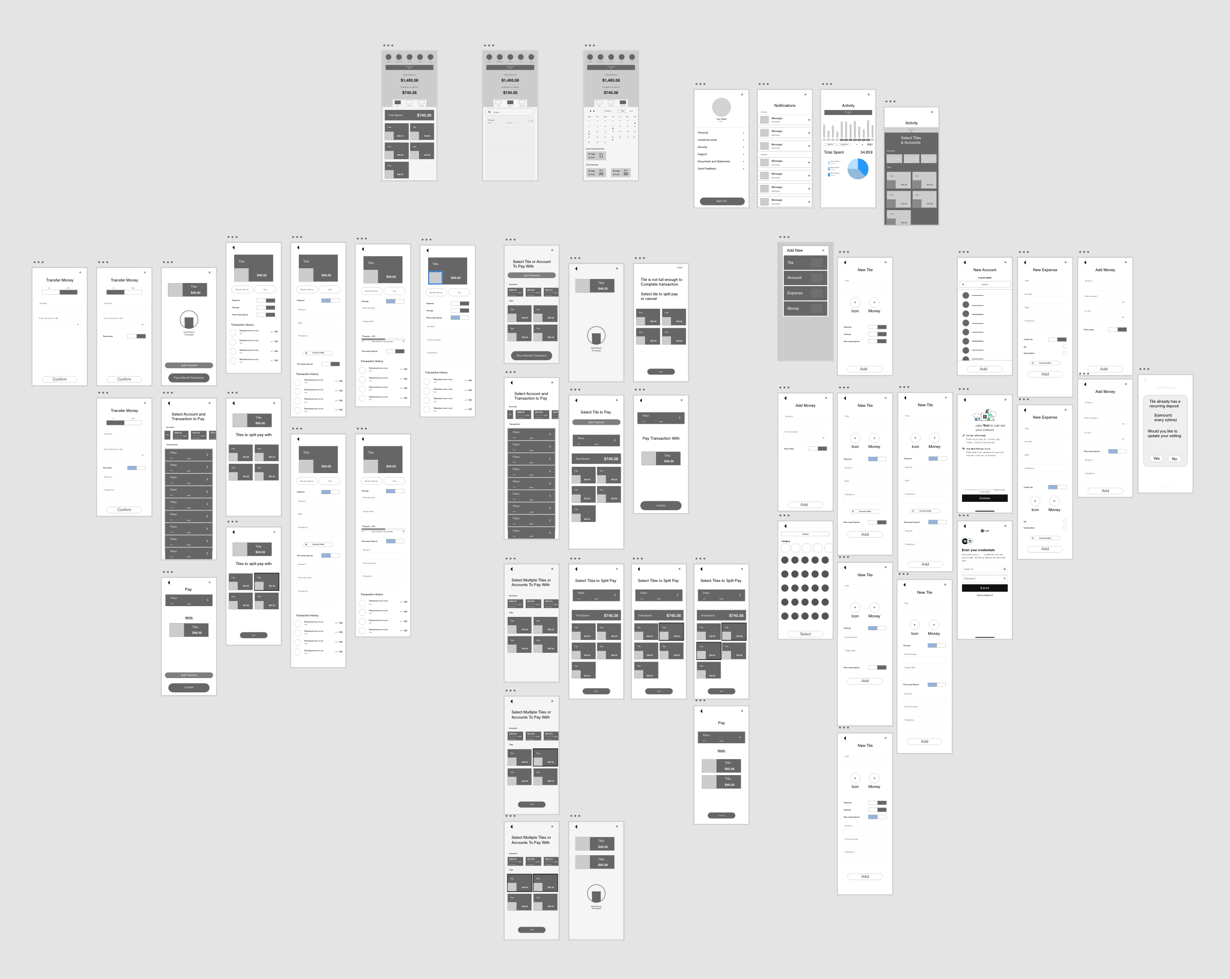
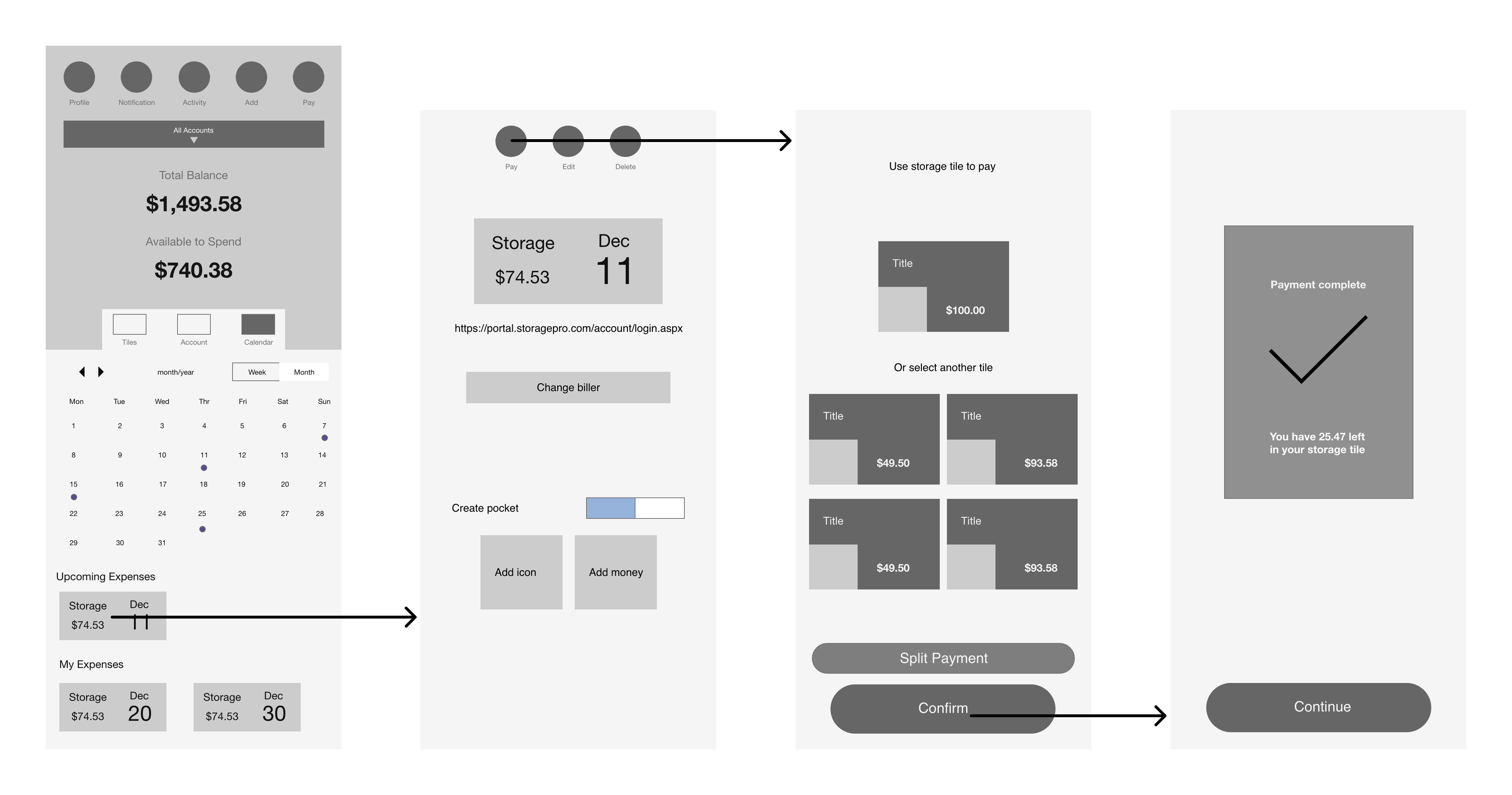
Turning sketches into digital wireframes brought clarity to core mechanics and exposed gaps in logic — helping refine the product's structure before high-fidelity design.
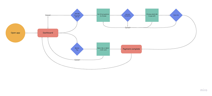
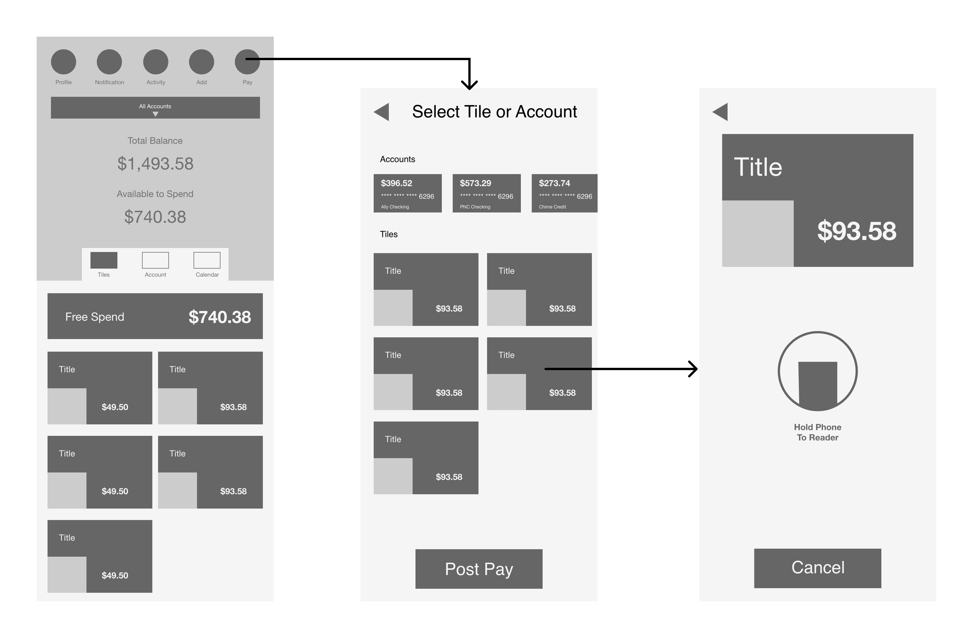
Core Function: Mobile Pay with a Pocket
A walkthrough of the most critical task: spending directly from a Pocket — the moment where clarity and control meet.
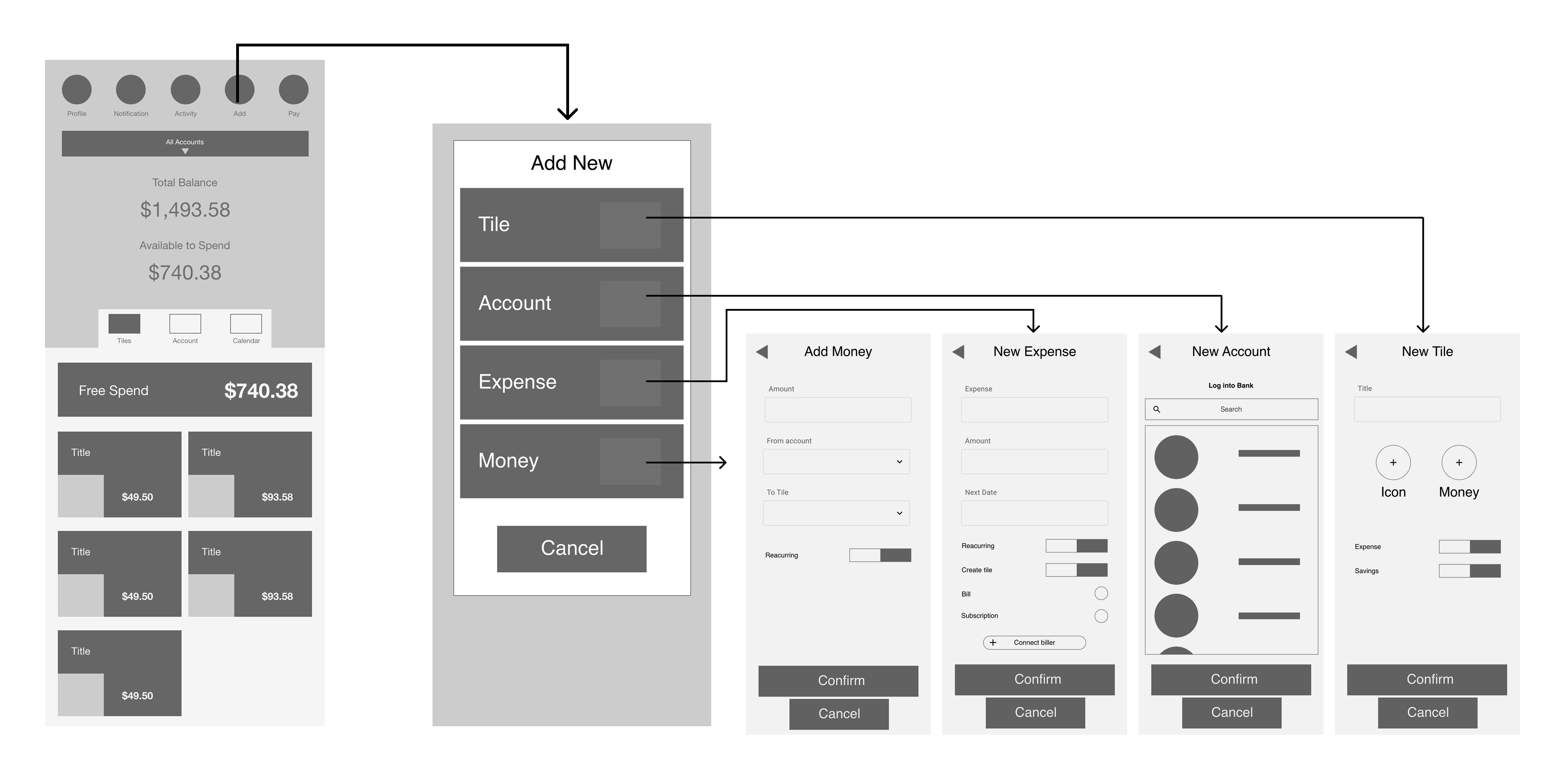
Key Wireflows
These flows helped validate how users would initiate, split, and complete payments inside the app.
Hi-Fidelity Screens
High-fidelity screens exploring core flows and key interactions.
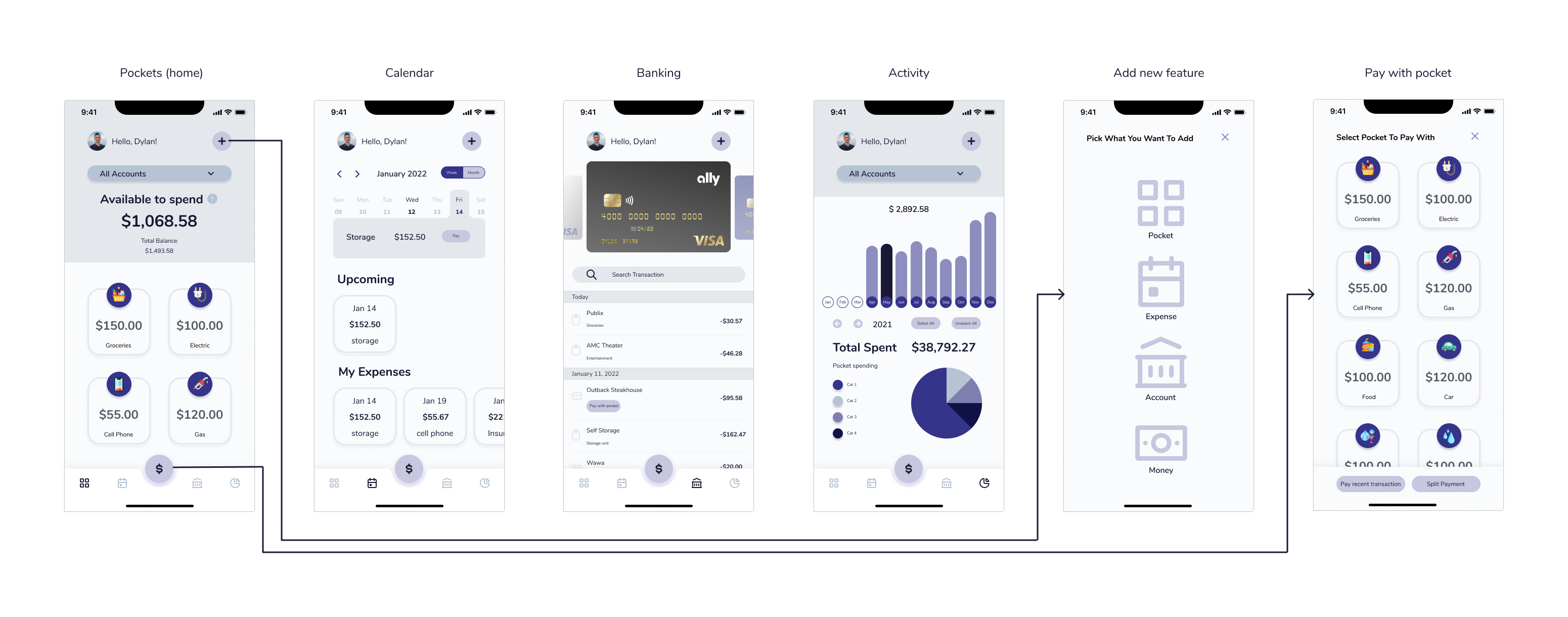
Main checkout flow
.jpg)
Selecting a Pocket, handling split pay, and assigning transactions retroactively.
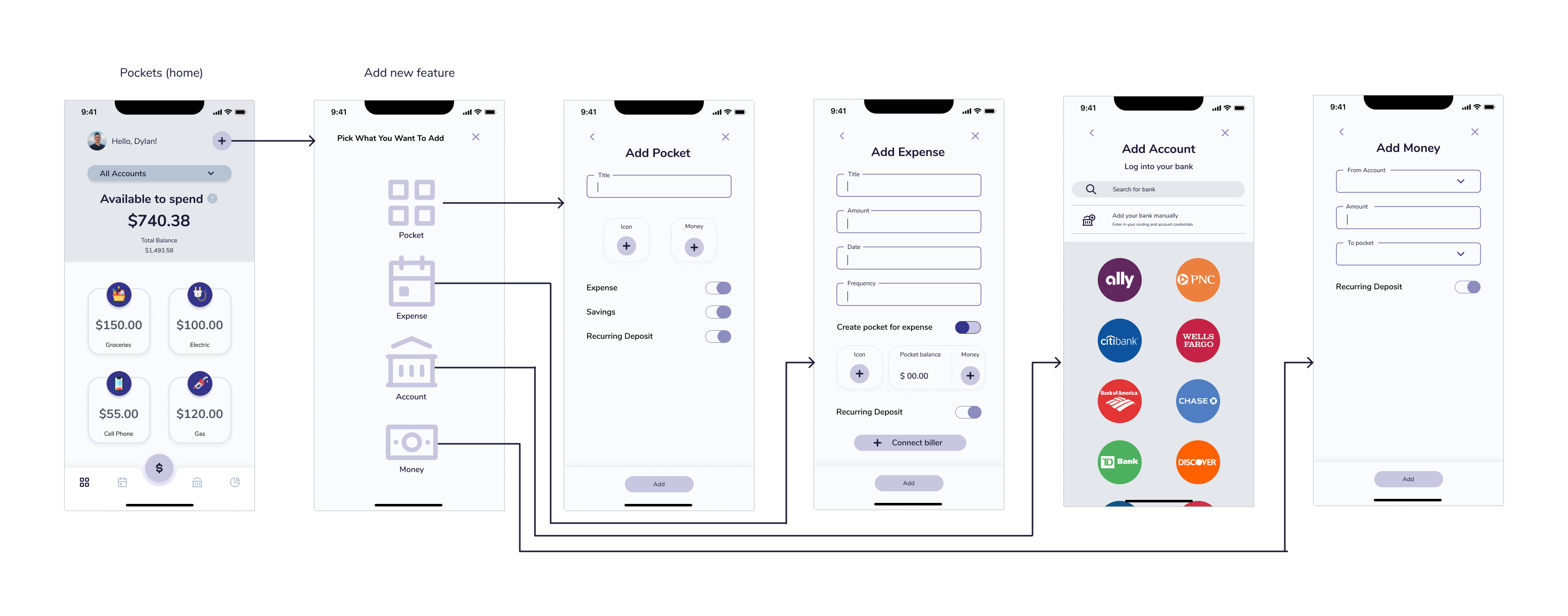
Adding pockets, expenses, and accounts.
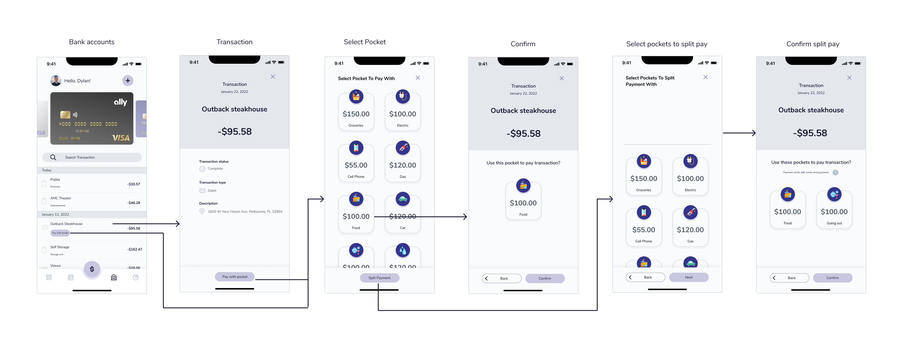
Linking a bank account.
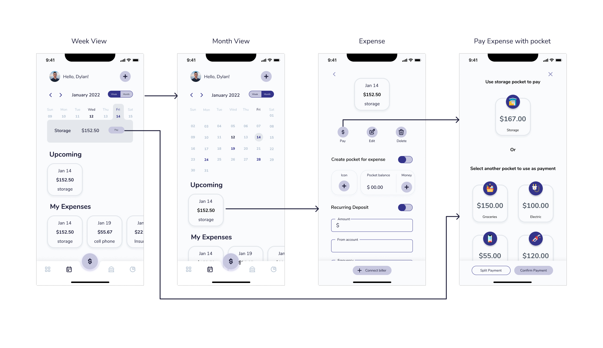
Viewing the calendar.
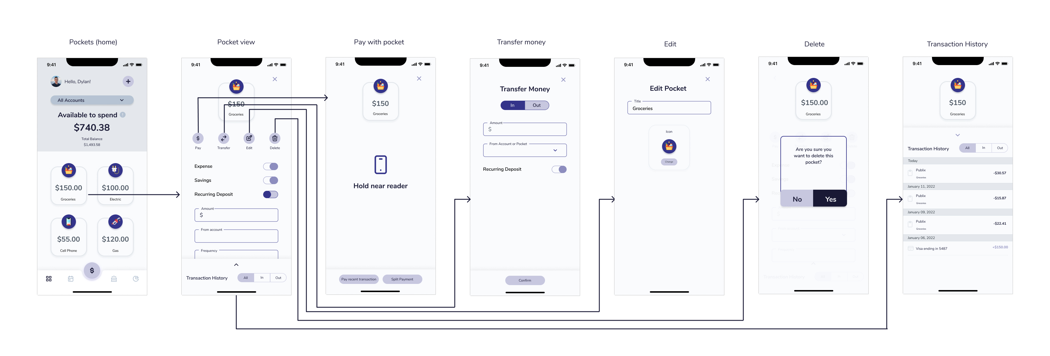
Pocket details and actions.
Testing & Iteration
I conducted usability testing with participants from the target demographic: young adults managing full-time or part-time finances.
Key Tasks Tested
- Use Mobile Pay at checkout
- Complete a Split Pay when a Pocket lacks funds
- Cover a debit card transaction using a Pocket
- Add an expense or Pocket
- Pay a recurring bill
Notable Frictions
- 💡 Split Pay was the most difficult interaction
- 🔍 Users didn't clearly understand payment types
- 📱 Mobile Pay UI confused users on next steps
- 🧩 Confirmation screens caused hesitation
- ➕ Add Pocket/Add Expense buttons weren't intuitive
Feedback led to key revisions across UI language, flow hierarchy, and toggle behaviors.
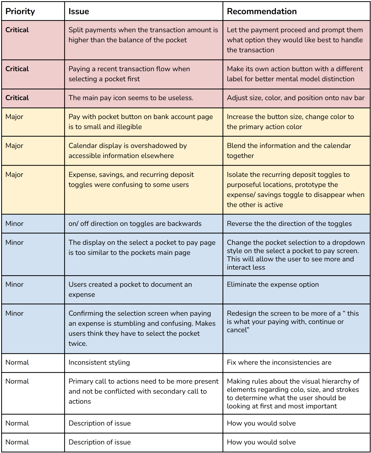
Summary of key user pain points across flows
Final Designs
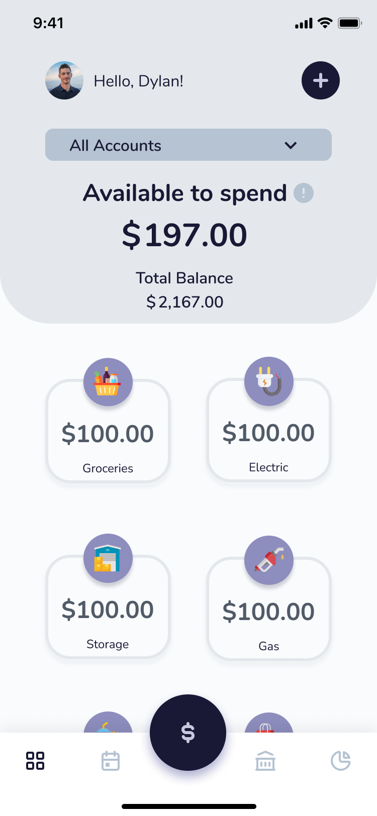
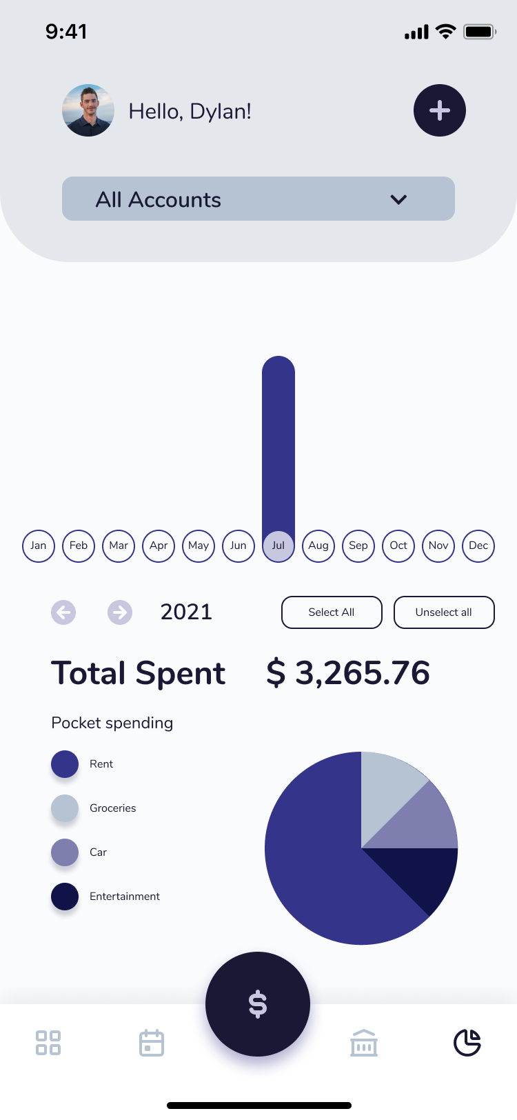
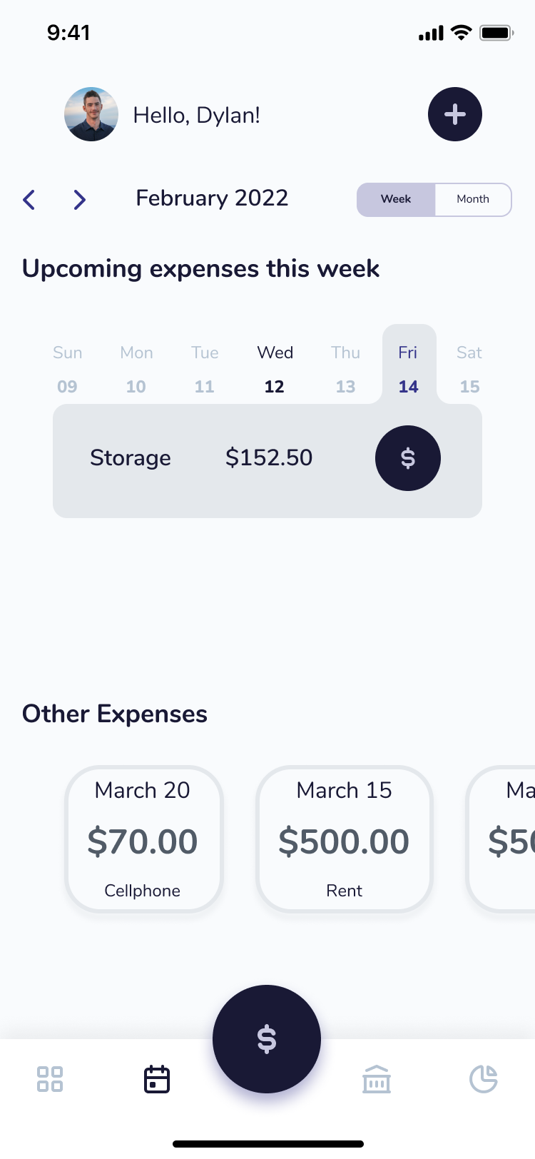
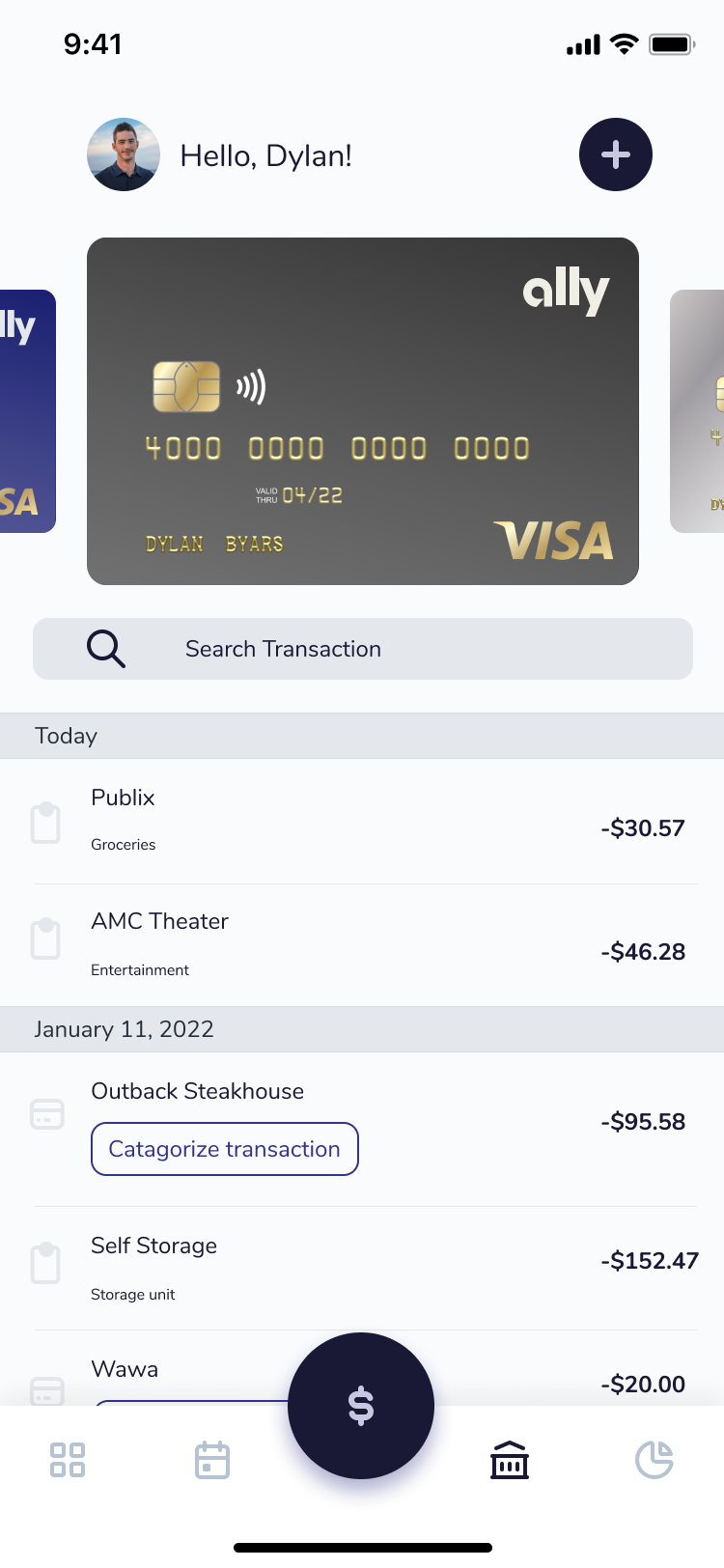
These high-fidelity screens represent the culmination of Pockets' design — focused on clarity, trust, and control.
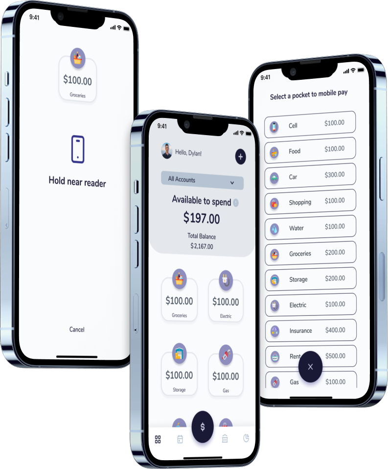
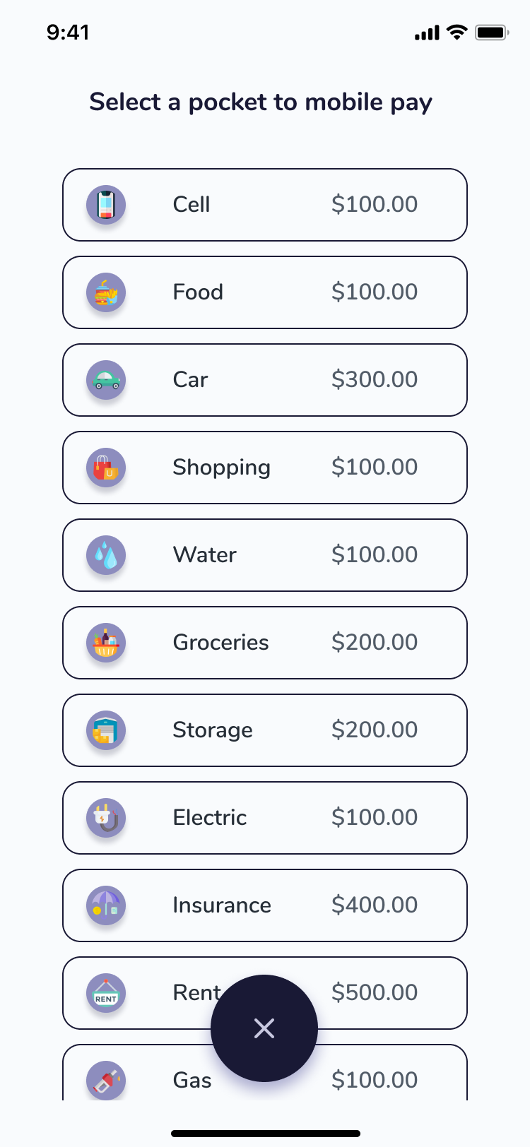
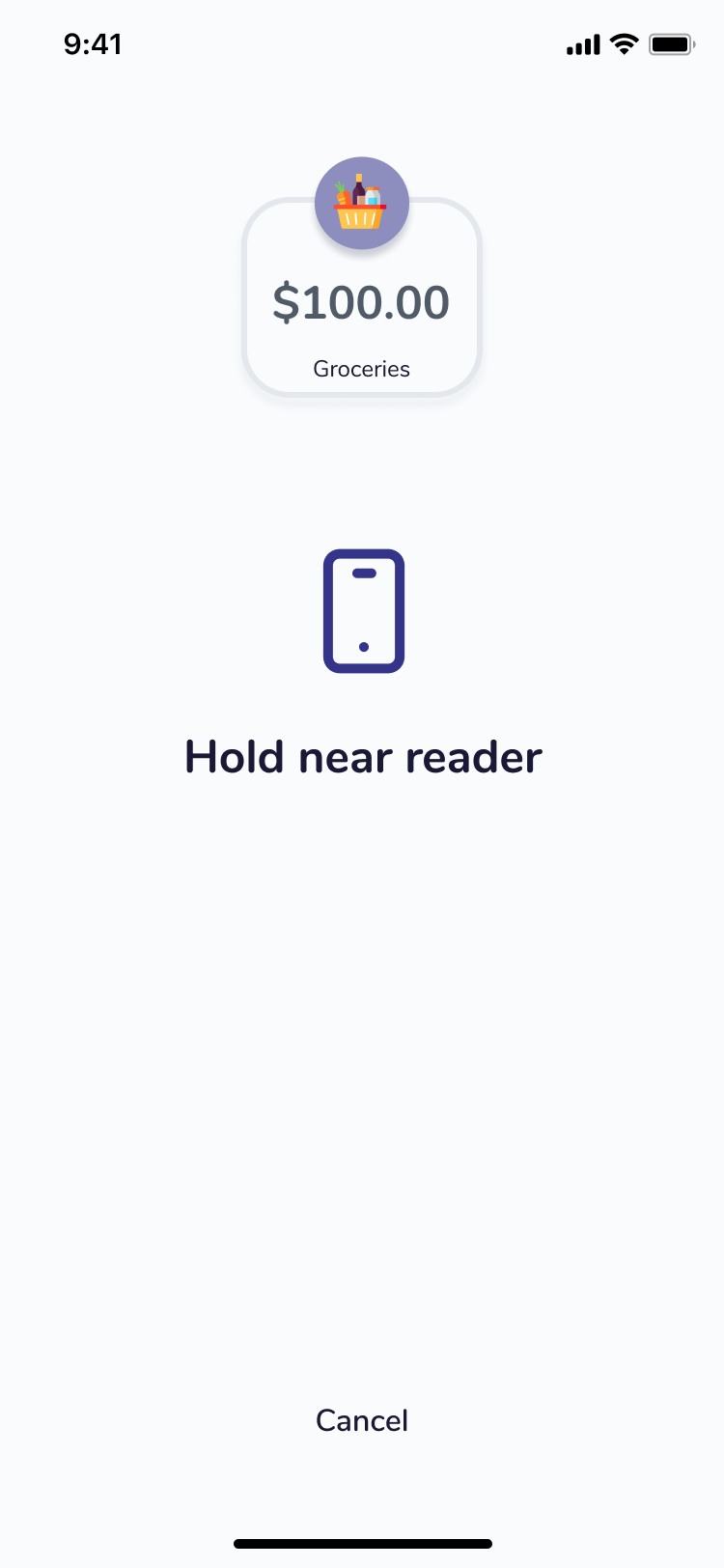
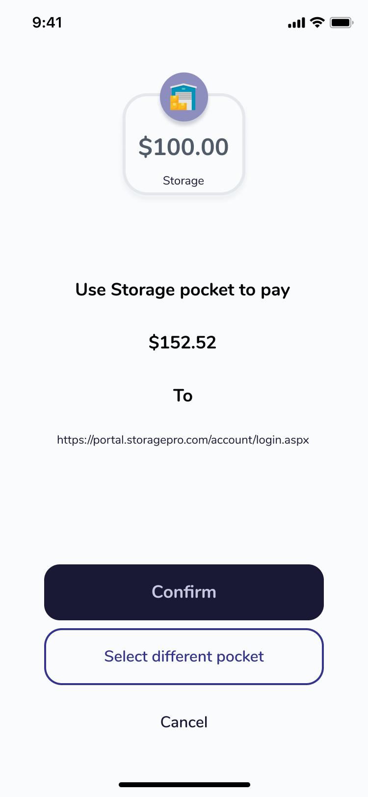
Next: I plan to iterate on this system and begin prototyping a real version of Pockets — one that links live accounts and makes mobile pay from named buckets a reality.
GET IN TOUCH
Copied to clipboard!
